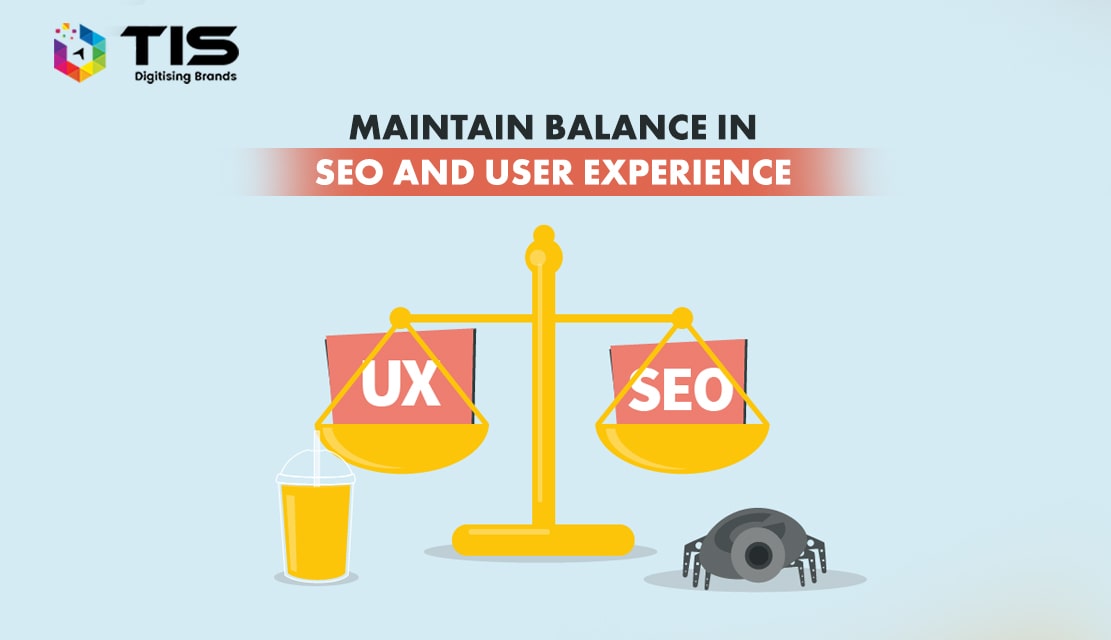
Qualified traffic is useless if your website cannot convert it. At the end of the day, your goal is to convert qualified visitors and boost your revenues. Achieving this is a combination of three aspects of your online presence management:
1. Offering an engaging user experience on your website
2. Performing On-page and off-page SEO
3. Consistently creating and publishing valuable content
Balancing SEO with user experience often poses a serious dilemma:
1. If you have the right SEO but have a nagging user experience, it will increase bounce rates. Your visitors want to easily engage with your content and know the next step they can take to address their concerns when they are on your page, e.g. easily read and skim through the content without crashing into popups, or easily navigating through the menus.
2. However, if you hold on to SEO in favor of a better user experience, search engines will not be able to properly understand and index your website and its pages. As a result, your website’s visibility will decrease and potential customers will not be able to find you on the Search Engine Results Page (SERP).
So, how can you balance SEO with the right user experience?
Below are some important steps you can take to create a balance between your SEO efforts and a user experience.
A poor website design and layout increases bounce rates. Higher bounce rates signal that the visitor’s search query (and keywords) that brought them to your website may not be reflective of the content and nature of your webpage.
Given that Google is committed to giving the most relevant results for search queries, reduced engagement and increased bounce rates could lead to the loss of ranking for certain key terms and phrases. Additionally, the overall usability of a website is an important ranking factor and can directly impact your site’s search visibility in search rankings.
Ideally, your website should be created around your customer’s journey: from the information gathering stage, through the decision-making stage, conversion, and finally follow-up. Your goal should be to create a design that allows your visitors to stick longer on your website per visit and bookmark it as a future resource.
Achieve this by making your website visually appealing, informative, and easy to navigate. Ensure that your design is reflective of your industry and displays the level of professionalism expected by visitors.
Navigating your website should be a simple and intuitive process for first-time visitors. The task of your navigation panel and CTAs is to direct visitors to the possible next steps they can take on your website. It should spell the most important actions, information, and resource that the visitor can interact with at first glance.
If your visitors are unable to quickly find what your website is about and where they can find what they are looking for, they will bounce and leave your website.
Complex, multi-level menus, and poor navigation layout lead to confusion and premature returns to search engines. Additionally, complex navigation and site XMLs also confuse crawlers and prevent them from properly understanding, indexing, and ranking your content.
Simplify your navigation panel by understanding your target audience and understanding what they are looking for when they visit your website. Once you have a thorough understanding of your target audience, create a navigation panel that has simple titles and uses a minimal number of sections/sub-sections so that visitors know exactly what they will get when they click through.
Being mobile-friendly, through responsive web design offers you SEO and UX advantages:
Keyword research is important for increasing the visibility of your website and its content in search engines. However, the rules of the game have significantly changed. As Google’s algorithms have become more sophisticated. They semantically understand the “concepts” behind every piece of content. As a result, Google bots can easily identify when the keywords appear unnatural to the page, are “stuffed”, or are needlessly used.
Avoid being penalized for overuse of keywords by creating and publishing content that reads naturally. The rule of thumb is to target specific keywords by using them in URLs, alt tags, headers, and title tags, and where they can naturally appear in the text.
Regularly update your website with valuable content so that it remains on the search engine radars. Consistently adding valuable content offers user experience and SEO benefits.
By creating valuable content for your brand, you increase the visibility of your website in search rankings and increase the chances of on-page optimization such as internal linking. Your target audience is always in search of content that offers them value and actionable insights they can try, implement, or use to make a more informed decision.
Hence, by creating valuable content qualified visitors will come to your website, and by properly linking them to other resources you increase the page depth of your website and hence retain each visitor longer. This directly increases the chances of conversion.
SEO increases online visibility and qualifies traffic whereas the right user experience qualifies leads and converts.
It’s your job to balance the power between them.
Achieve that by remembering the two rules of thumb:
If you want your website to be popular among the customers, the most fundamental way to do so is to create a website that is absolutely compatible with their needs. When people spread the word about your website, they are actually sharing the experience that they have had with your website. So, it is very important to create your website in a way that your users feel eager to share about your website with their peers.